Understanding the Sawtooth Diagram: Inventory Management Made Simple
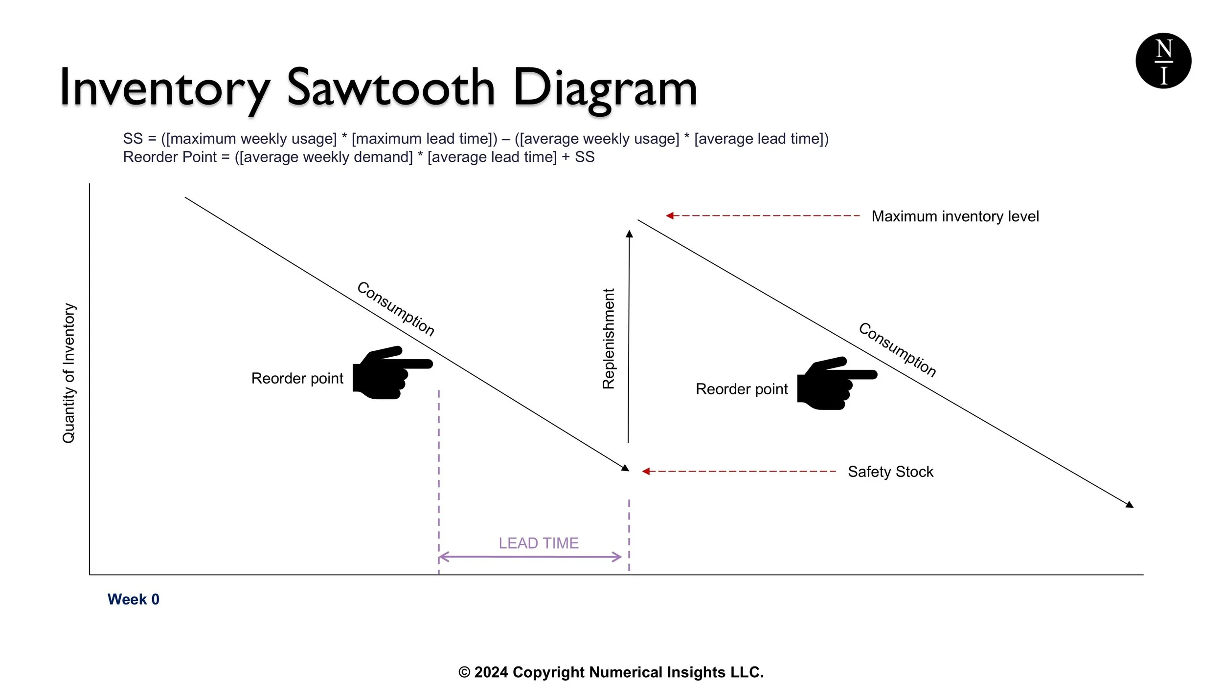
The saw-tooth diagram is a graphical representation of inventory stock levels over time. It demonstrates how inventory is replenished and consumed, providing insights into inventory dynamics in a simple visual format. Here's how to read it.
Watch the video explanation instead.
The X-Axis: is time, likely in weeks or months.
The Y-Axis: is the Inventory Level (which is your quantity in, say, units).
The Slope of the line Downwards is consumption of inventory. If this chart is for a finished good, that consumption would be sales. If this chart is for a raw material or component, consumption represents usage in production.
The Vertical Spike Upward is replenishment or restocking which brings the inventory back to a higher level. An example of this would be receiving a supplier delivery into your system.
Here’s How the Timing of Inventory Works
As products are sold or used in production, the inventory level decreases gradually.
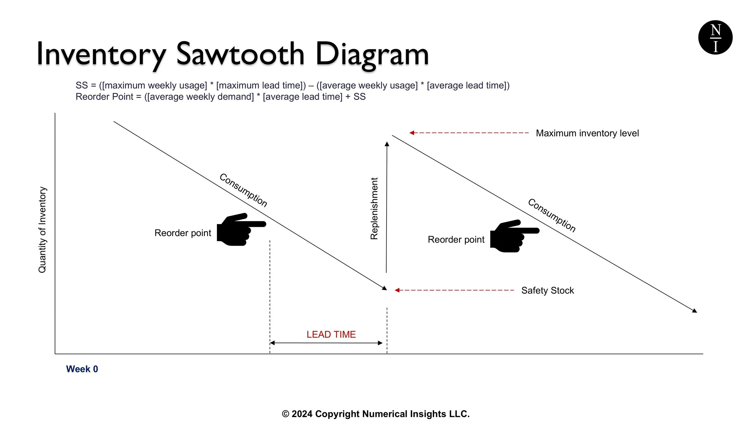
The downward slope (labeled consumption in the above image) represents the rate of consumption or customer demand.
When the inventory level reaches a specific threshold, which we call the reorder point, an order is placed to replenish stock. (The reorder point is the pointed finger in the image above.) The reorder point is a number which can be calculated.
Ordering at the Reorder Point helps ensure that inventory is replenished before reaching zero, i.e., before you become out-of-stock on that item.
When the new stock arrives, inventory levels instantly jump to a higher level when you receive them. That’s why increases in this chart are vertical lines.
The repeated pattern of consumption and replenishment back and forth over time, creates a "saw-tooth" appearance on the chart.
Key Metrics Illustrated in This Chart
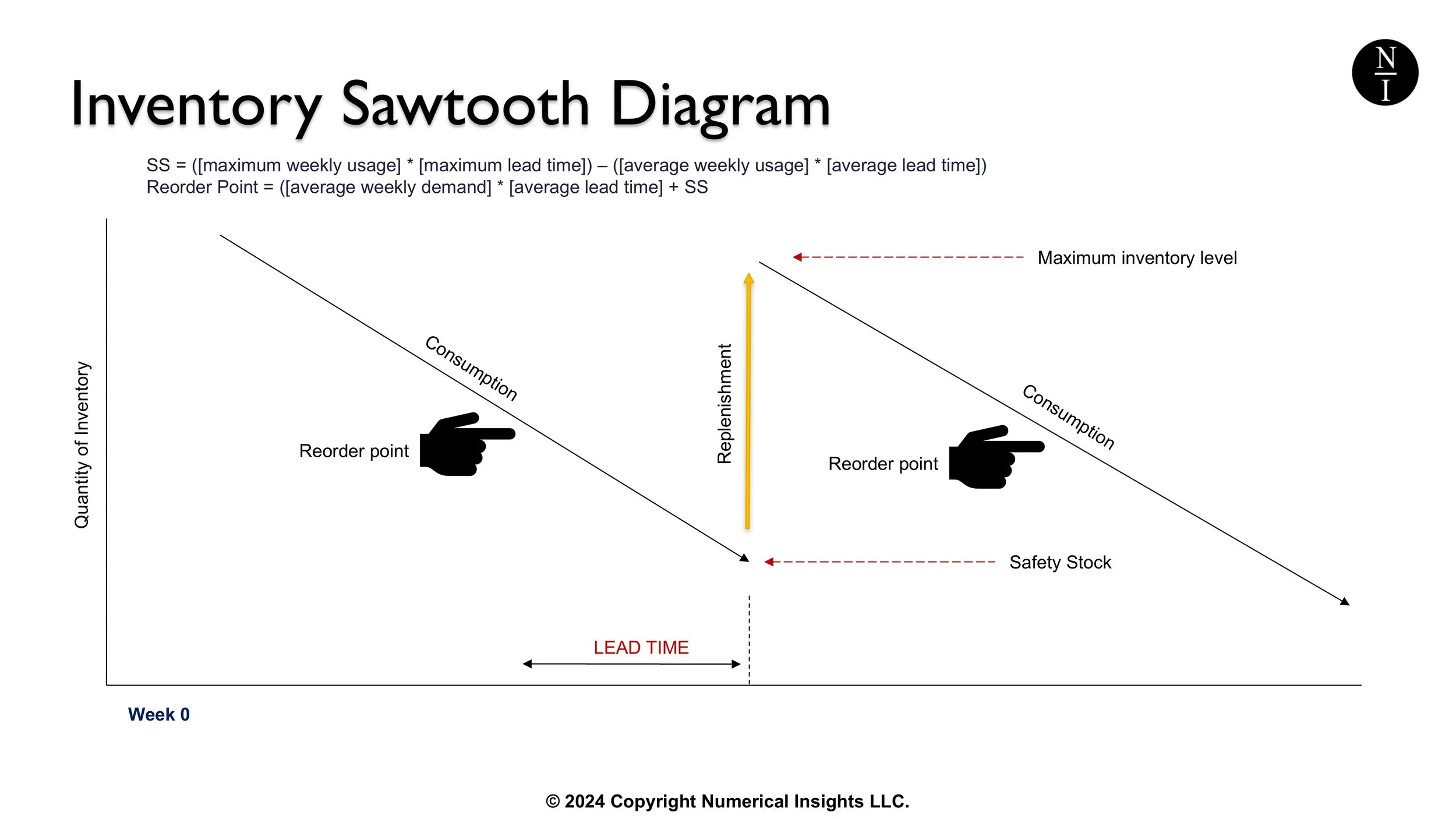
Image: The vertical, gold line is the order quantity which occurs when a supplier delivery is received.
Order Quantity: This is the size of each replenishment order, represented by the height of the upward spike (shown as a gold arrow on the chart above). Depending on minimum order quantities, you may choose to issue one larger order within the lead time for this item or to issue several smaller orders spaced out over time.
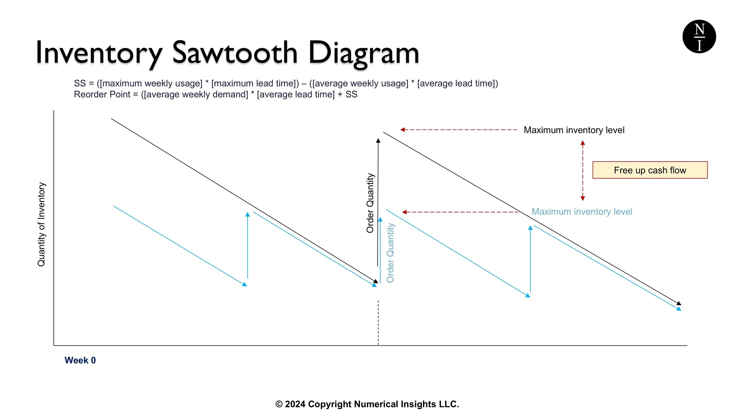
Image: The impact of order size on the amount of cash flow needed for peak inventory.
Let’s take a look at the difference between issuing one larger order vs. several smaller orders. The black line (in the image above) is the sawtooth pattern you’ll see if you issue one order within each lead time period. The blue line is the sawtooth pattern you’ll see if you issue several smaller orders within each lead time period.
You can see with the smaller orders, your inventory levels don’t have to spike so high. The difference in height between the two lines is how much you will save in cash flow on this item by not having to stock as much at once.
Whether you have the option to space out smaller orders will depend on how far away your suppliers are as some companies are restricted to ordering an overseas container-full for freight savings. If your suppliers are geographically closer, it’s easier to order less. Each supplier may also have a minimum order quantity, MOQ for short, that they will impose upon you.
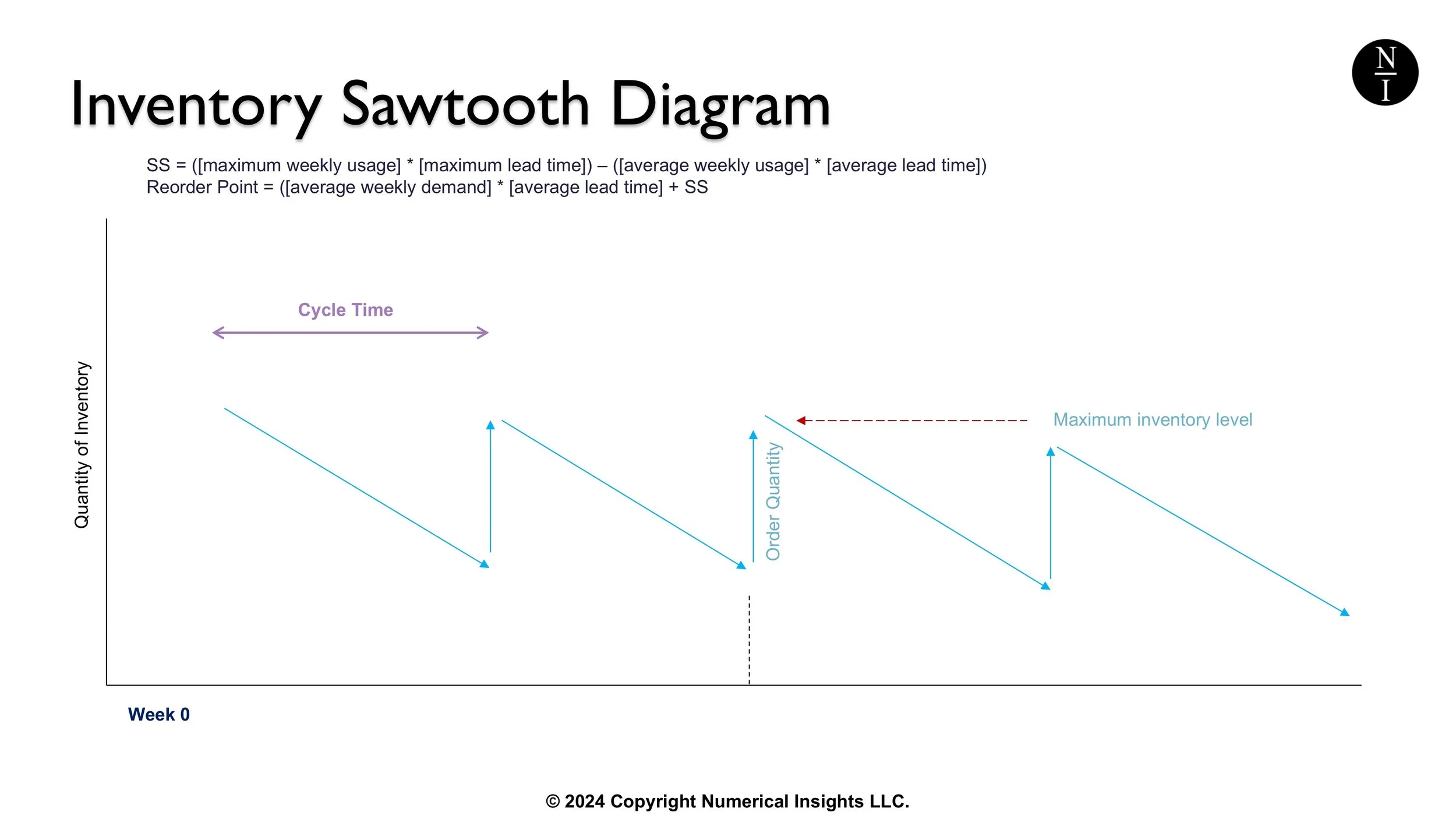
Image: Cycle time displayed on sawtooth diagram.
Cycle Time: The time interval between successive replenishments, measured along the x-axis. In the image above, the cycle time is shown in purple.
Image: Lead time shown on sawtooth diagram.
Lead Time: The delay between placing an order and receiving it, represented by the gap before the inventory spike after reaching the reorder point. The lead time on the image above is shown in purple.
Image: Safety stock level show on sawtooth diagram.
Safety Stock: This is a buffer stock level maintained to avoid stockouts during unexpected demand or delays. This is a value which can be calculated. In the image above, the safety stock level is shown in purple.
Summary
In summary, the saw-tooth diagram is widely used in inventory management to provide a clear and visual understanding of how inventory levels fluctuate in response to demand and choices you may for replenishment.

